Building the UI
React - and lots of it!
It’s been 2 weeks since the coding period started and it’s finally time for me to showcase the work that I’ve done so far.
Note: This is my 2nd Bi-Weekly blog. You can find the rest of them here
Summary
For those in a hurry, here’s a quick summary of what I’ve done so far.
Firstly, I created a React front-end based on the designs I had come up with during the application period. There are some changes here and there, but the overall design is the same.
Next, I moved on to integrating the backend with these new changes. This was fairly straightforward but I had to take care not to break any existing functionality.
The result of that is a fully functional course creation modal that allows users to configure Article Scoped Programs more easily - all with autocomplete, error detection, and more!
The UI
Let’s go into a bit more detail now, shall we?
Building a UI sounds easy but it invariably involves a lot of back and forth between your designs and the actual code. Once you get to implementing the design, you eventually end up realizing things that are simply not feasible or are too difficult to implement. Let’s take a concrete example - here’s the design and the final implementation of the scoping methods home page respectively.
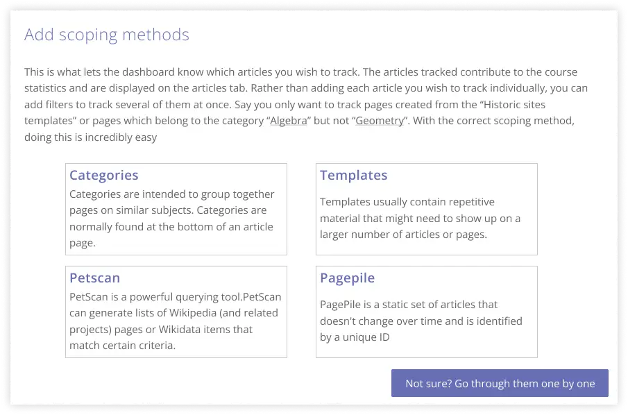
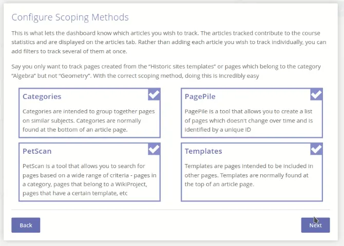
As you can tell, the idea is the same - but instead of going through all of the scoping methods, now the user can select the ones they wish to configure. This also allows an easy way to skip this entirely. Thanks to my mentor Sage for this excellent suggestion about checkboxes! It looks great and the overall experience is much better than before.
That’s just one of the many things that I realized while implementing the designs. The point I’m trying to make here is that most of the time, the designs are just a starting point. If you get too hung up on them, you’ll end up wasting a lot of time. Instead, it’s better to just get started and iterate as you go along.
The autocomplete problem
One of the features that I was most excited to implement was the autocomplete feature for categories, templates, and pages. Just this feature alone adds a level of polish to the interface that was missing before - both in terms of functionality and aesthetics.
The question was - how do I implement it? This might sound like a simple question - just use the MediaWiki API and filter based on the user’s input. I thought so too, but as soon as I got to implement it, I realized one major flaw with this approach.
Each Wikipedia - that is, say the English Wikipedia, the French Wikipedia, etc. - has its own set of categories, templates, and pages. So, if I were to use the MediaWiki API, I would have to make a separate request for each Wikipedia. This would be a huge performance hit and would also be a nightmare to maintain.
One way to solve this would be to add a way for the user to select which Wiki they wish to search in. This would be a lot of work and would also be a bad user experience. Imagine having to select the wiki you want to search in every time you want to add a category or a template. Not good.
So I settled on a different approach. I decided that we would use the API for the Home Wiki of the course. I thought this was a reasonable middle ground between giving the user manual control(and losing all the simplicity of the interface) or locking them into just English Wikipedia(and losing all the flexibility).
However, after having talked with a few users of the Dashboard, I’ve realized that most people do want a way to track across multiple wiki projects. So what I’m thinking of doing next is to default to the home wiki, but also allow the user to select other wikis if they wish to do so. Best of both worlds! This is the way it works in the old interface so I’m kind of surprised I didn’t think of it earlier.
The backend
This was the easiest part of the whole process. After all, all the tracking logic already existed in the backend. All I had to do was to make sure that the new UI was able to communicate with the backend in the same way as the old UI.
And once that was done, we had a fully functional course creation modal!
What’s Next
While I have made a lot of progress, there’s still a lot of work to be done. Firstly, even this feature hasn’t been merged yet. I just finished working on it yesterday, and now we’re in the review phase. This takes a lot longer than you’d expect but I do hope that users can see this feature in action by the end of this month.
Apart from the technical stuff, my next couple of weeks are mostly going to be spent talking to users and getting feedback on the new UI. I’ve already conducted a few interviews and have got a lot of great feedback. I’m hoping to do more of that in the coming weeks.
And that’s about it. Hope you enjoyed reading this blog post and I’ll see you again in 2 weeks!